

Brand Strategy & Visual Identity System
The Skin Societé is a people-first aesthetics and wellness studio that blends expert treatments with a holistic, transformative approach. I developed a bold, editorial-inspired visual identity that captures the studio’s mission: to empower clients through subtle yet impactful transformations. Drawing inspiration from luxury fashion houses and wellness culture, the brand world balances high-end sophistication with authentic, human connection.
The Skin Societé
ROLE: Brand Designer & Identity Strategist
TIMELINE: 8 Weeks
DELIVERABLES: Logo Suite, Color & Typography Systems, Guidelines (including Voice, Values, Competitor Analysis, Positioning Statements, Customer Personas)
*Brand Photography by Alexx Acor Photo
Challenge
Entering a saturated aesthetics & injections market in Utah, The Skin Societé (TSS) needed a brand identity that could break away from traditional clinical aesthetics and stand out in a competitive, trend-driven beauty market. The goal was to create a confident, fashion-forward visual presence that still felt approachable, holistic, and deeply personalized — establishing the brand as both a cultural authority and a trusted partner in long-term client transformation.
Questions that guided our discovery sessions: “How can we position The Skin Societe to stand out visually from a sea of boring, beige competitors & larger, clinical med spas? How do we position TSS as the it-girl of aesthetic injections in Utah and eventually beyond?”


Approach & Strategy
Building on The Skin Societé’s mission of meaningful, holistic transformation, the brand strategy centered around positioning the studio as a culture creator — blending the aspirational world of high fashion with the authenticity of functional wellness.
Through competitor analysis and audience profiling, it became clear that clients seek more than aesthetic results; they crave expert guidance, empowerment, and emotional connection. This insight shaped every creative decision: from developing a logo and typography system inspired by luxury fashion houses to crafting a visual language that celebrates real, radiant transformations over fleeting trends.
The brand world was designed to feel empathic yet authoritative — offering clients a space where confidence is cultivated, not manufactured.
Creative Execution
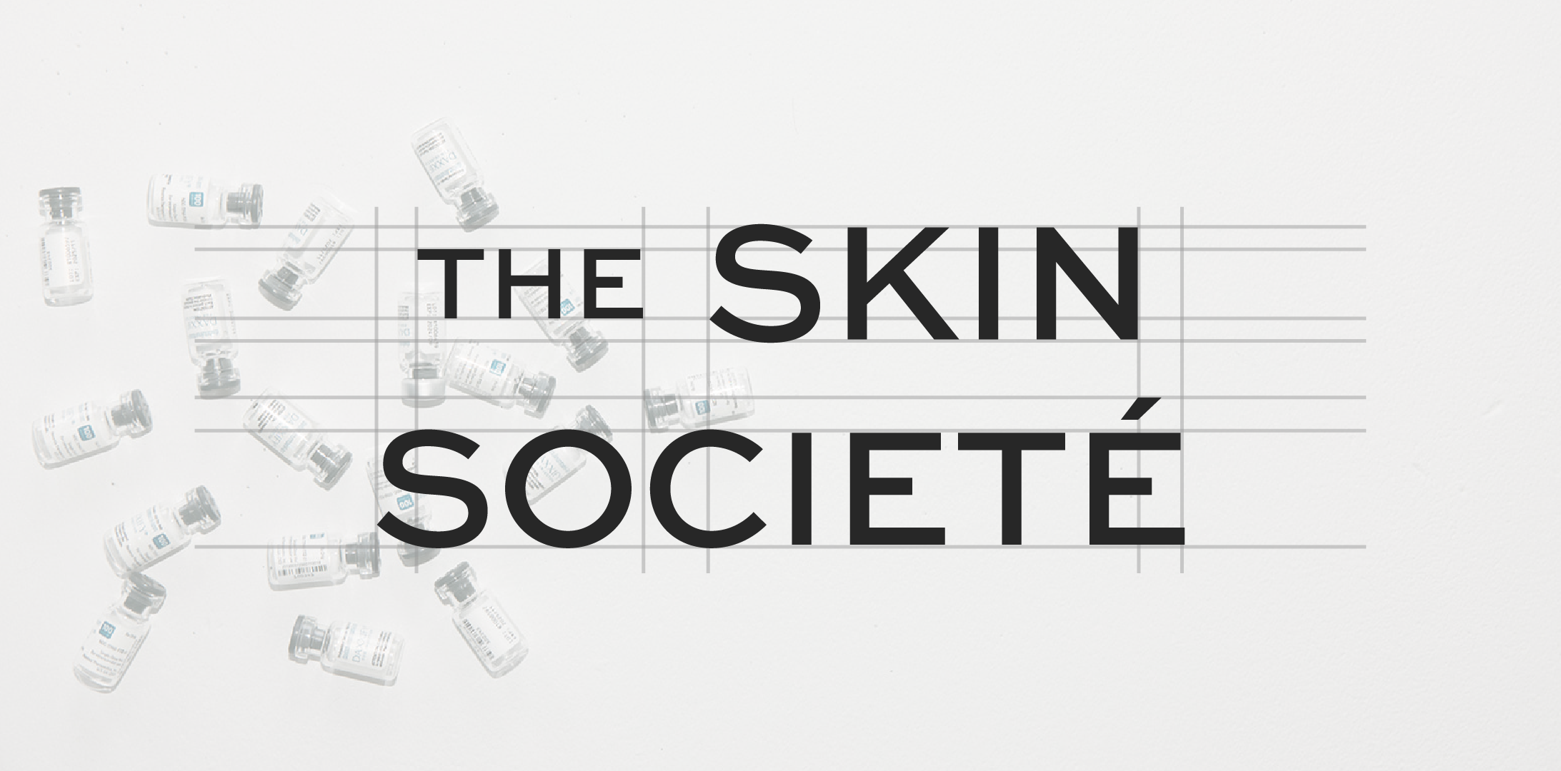
Logo Design
The Skin Societé’s logo system is built on confident, fashion-inspired typography, reflecting the brand’s role as a culture creator within the aesthetics space. The custom sans-serif wordmark carries subtle bespoke modifications, creating a distinct, memorable silhouette. A bold, abstract monogram version was developed as a “stamp” — a symbol of authority, transformation, and empowerment within the beauty industry.
The Skin Societé’s color system reflects the brand’s philosophy: grounded in trust and expertise, yet always evolving, expressive, and alive. The palette is grounded in a refined slate gray and soft off-white, creating a neutral canvas that evokes sophistication, clarity, and calm. Bold cabernet red and light sky blue accents introduce unexpected vibrancy — symbolizing confidence, vitality, and openness.
Used sparingly, the accents command attention without overpowering, reinforcing TSS’s subtle yet impactful approach to transformation.
Color Palette


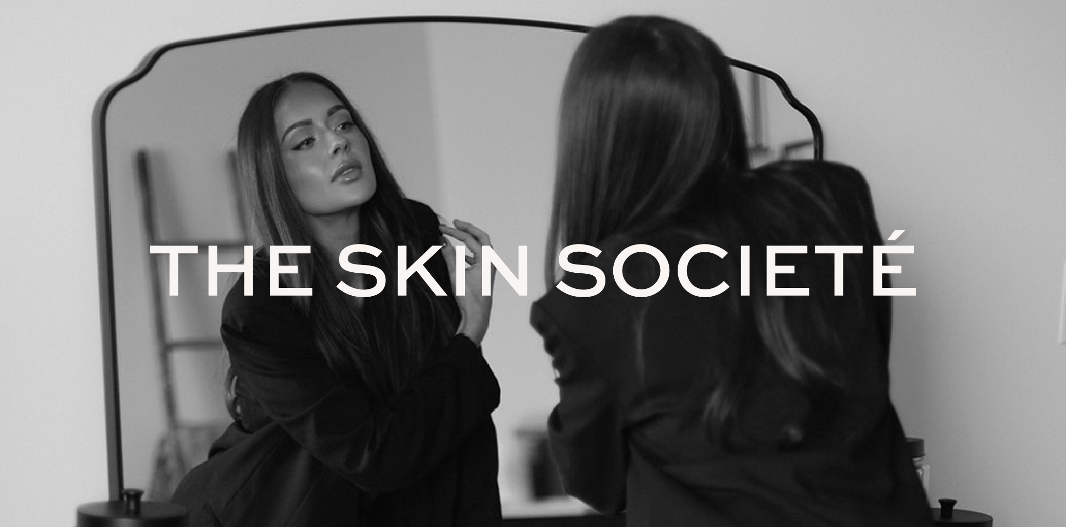
Photo Direction
The Skin Societé’s visual language draws heavily from fashion editorials: sharp lighting to sculpt features and emphasize skin radiance; intentional negative space to highlight transformation and ease; leaving room for bold text overlays on imagery to make statements with authority. Design layouts are sleek and minimalist, letting typography and imagery lead without clutter.


