

Brand Strategy & Visual Identity System
Flourish Therapy Inc.
Flourish Therapy Inc. is an LGBTQIA+ affirming nonprofit organization in Utah, doing truly lifesaving work in the form of free and subsidized therapy for LGBTQIA+ youth and their families.
ROLE: Web & Brand Designer
TIMELINE: 8 Weeks
DELIVERABLES: Refreshed Logo Suite, Color & Typography Systems, Illustrations; Web Design/Migration
Challenge
Flourish Therapy needed a refresh—as their practice grew, with an exceedingly long waitlist of patients, they needed to reach donors that could help fund their operations. As a non-profit, they rely partially on donor support to help fund their operations. With similar non-profits in Utah that had established themselves as leaders in the community for LGBTQIA+ support, Flourish needed to modernize their identity & website to improve their online presence and appeal to a broader audience.


Approach & Strategy
Flourish had a clear mission & goals, but not enough internal support to make a long-needed site migration from Wordpress to an easier to manage hosting platform. Their team needed something user-friendly, modern, and fresh. A consistent color palette and typography system, with refreshed logos and image direction was a simple yet effective approach. After researching competitors’ visual identities we found a unique opportunity for differentiation. Most competitors had a very clinical approach, and we wanted to humanize Flourish’s identity using custom bright and colorful illustrations.
Creative Execution
Logo Design
Flourish’s logo was solid, but like their site, its color application was dated. As we aligned on a new palette, we didn’t need to reinvent the wheel with their logo. It would be impractical for them to reprint marketing materials with a new logo, swap signage at all their locations etc; so we aligned on updating their current logo’s colors so that they could phase out the previous version over time.

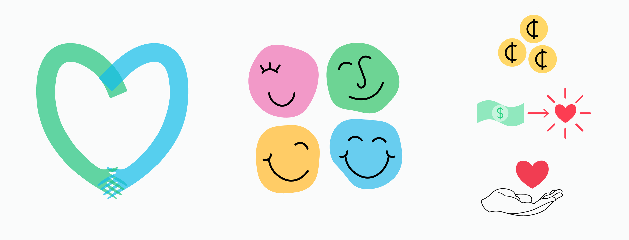
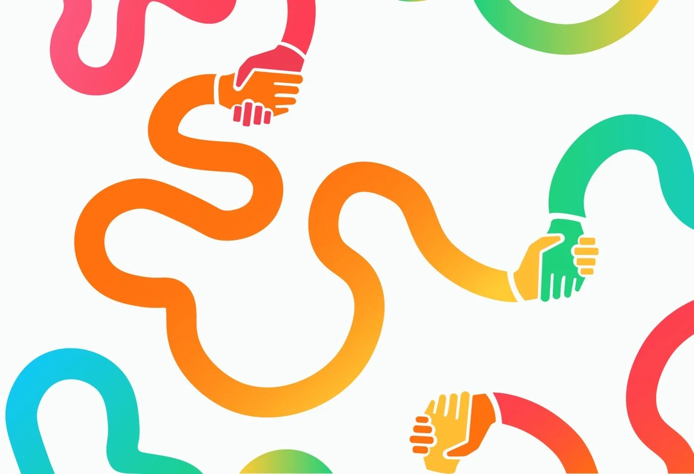
Illustrations
Using organic shapes and playful linework, these illustrations reflect the emotional depth and individuality of the LGBTQIA+ community. Smiling faces, hand-drawn elements, and metaphorical representations of connection and care visually communicate Flourish’s mission in a way that feels hopeful rather than heavy.
These illustrations not only added visual cohesion to the refreshed site, but also became an ownable part of the brand’s identity—reinforcing trust and accessibility at every touchpoint.


Site Design & Migration
Unfortunately I didn’t grab much of the previous site to show before and afters, but here is a small comparison of where we started vs where we landed once the site had been fully migrated. We moved and re-designed all pages, including 20+ therapist bio pages, an improved resources page, and numerous blog posts.

BEFORE
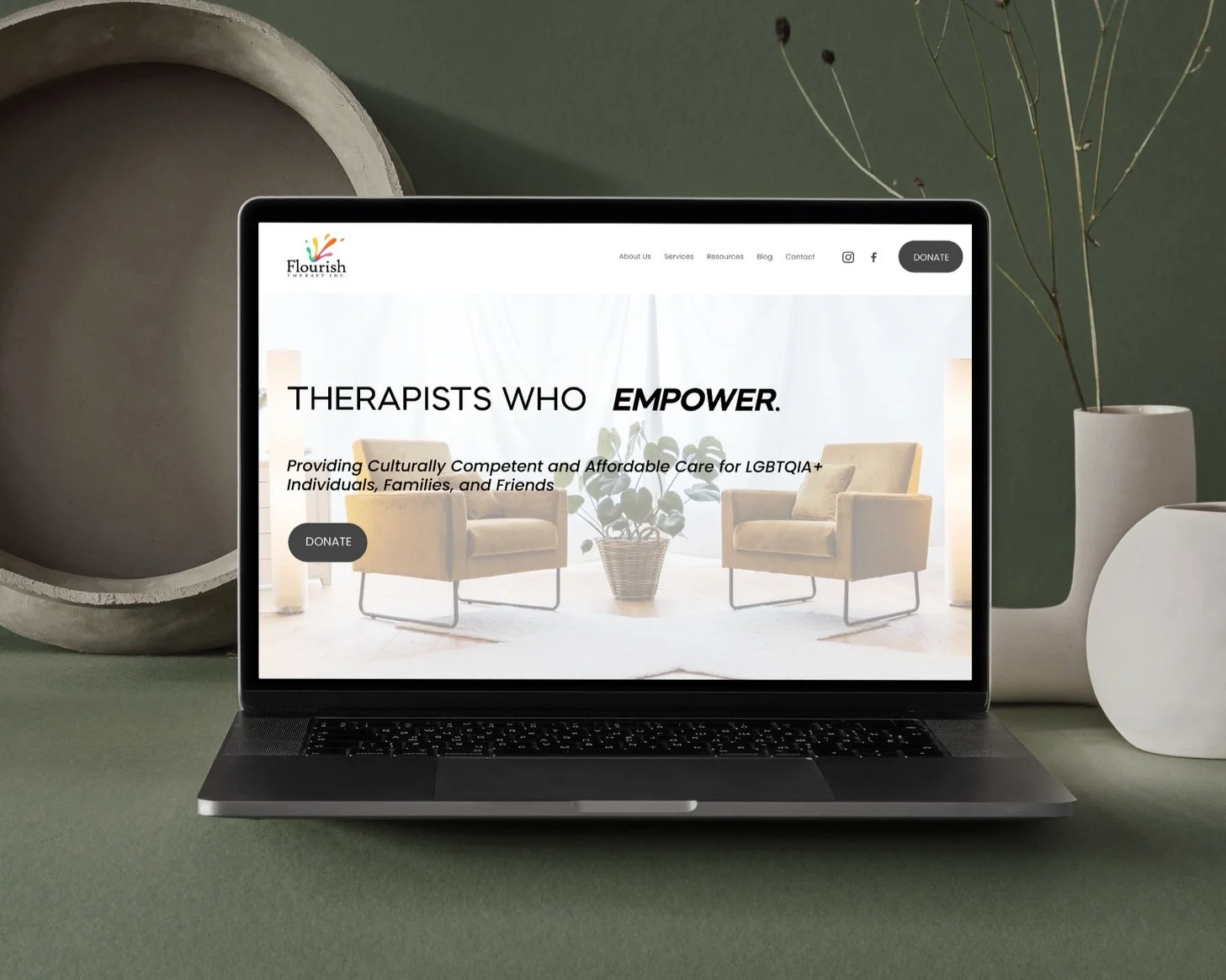
AFTER